The Smarter Way to Pick Paint Colors: Room-by-Room Choices That Impress Buyers and Feel Great to Live In
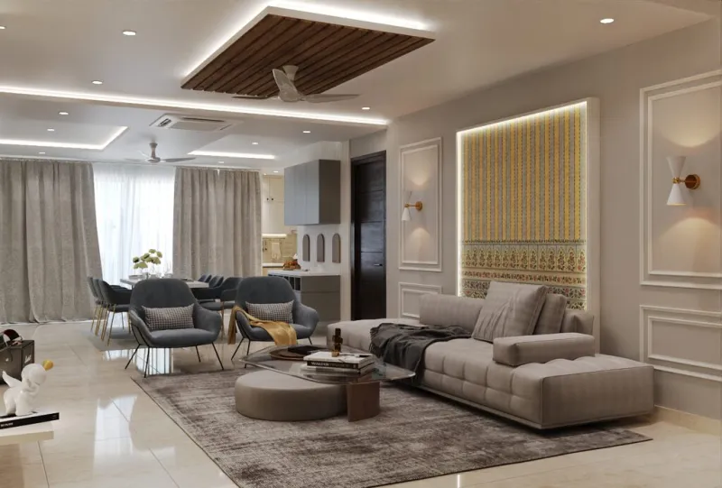
Photo: interior designer painting living room wall with neutral warm gray paint color swatches, via www.aertsen.in
If there's one DIY project that delivers an outsized return for minimal investment, it's a fresh coat of paint in the right color. A $50 gallon of paint and a weekend afternoon can completely change how a room feels — but only if you're making smart color choices. Go wrong, and you've spent money to make your home harder to sell and less enjoyable to live in.
The good news? Color selection doesn't have to be guesswork. There's real research — from real estate data, environmental psychology, and consumer behavior studies — that tells us which colors work, which ones backfire, and why. Here's how to use that knowledge room by room.
Why Paint Color Actually Matters (More Than You Think)
A now-famous Zillow study found that homes with certain paint colors sold for thousands of dollars more than comparable homes with different colors. Blue-gray bathrooms, for example, fetched over $5,000 more at sale. Caramel or yellow kitchens sold for less. These aren't trivial differences for a project that costs under $200 in materials.
Beyond resale, color affects how we actually feel in a space. Environmental psychologists have documented for decades that cool hues (blues, greens, soft grays) lower perceived stress and heart rate, while warm saturated colors (deep reds, bright oranges) increase energy and appetite. You can use this to your advantage in every room of your house — or ignore it and wonder why certain spaces always feel slightly off.
The Living Room: Warm Neutrals Win Every Time
The living room is where most buyers form their first real impression of a home, and it's where families spend the most time together. This is not the place for bold experiments.
The colors that consistently perform well here are warm greige tones — a blend of gray and beige that reads as sophisticated without being cold. Think Benjamin Moore's Revere Pewter (HC-172), Sherwin-Williams Accessible Beige (SW 7036), or anything in the warm taupe family. These shades photograph well (important for online listings), complement almost any furniture, and feel welcoming without being overwhelming.
Avoid stark white in living rooms — it tends to feel clinical and unfinished unless your home has exceptional natural light and very deliberate modern styling. Cool grays can work, but they require warm lighting and warm-toned furnishings to avoid feeling cold.
Pro tip: Paint your ceiling a shade or two lighter than your walls rather than going stark white. It creates a subtle coziness and makes the room feel more intentional.
The Kitchen: Where Color Research Gets Interesting
Kitchens are where the Zillow data gets really specific. Yellow kitchens — a color that was enormously popular in the early 2000s — have been shown to negatively impact sale price. Bright white kitchens can feel sterile to buyers unless they're paired with warm wood tones and quality fixtures.
What actually works? Soft, muted blues and blue-greens are having a long, sustained moment in kitchen design — and unlike trendy accent colors, they're holding their value in the market. Colors like Sherwin-Williams Rainwashed (SW 6211) or Benjamin Moore Sea Salt (2123-40) feel fresh without being jarring, and they photograph beautifully.
For a more classic approach, warm off-whites like Benjamin Moore White Dove (OC-17) or Sherwin-Williams Alabaster (SW 7008) are universally appealing in kitchens and let your cabinets, counters, and hardware do the visual work.
If you have a kitchen with limited natural light, avoid dark colors on the walls almost entirely. A deep navy island can be stunning, but dark walls in a dim kitchen will make the space feel like a cave.
The Primary Bedroom: Calm Is the Goal
Bedrooms should feel like a retreat, and color psychology is consistent on this point: cooler, lower-saturation colors promote relaxation and better sleep quality. Soft blues, muted greens, and gentle lavenders all outperform warm, energetic colors in bedroom settings.
For broad appeal (important if you're preparing to sell), stick to soft blue-grays or pale sage greens. Sherwin-Williams Quietude (SW 6212), Benjamin Moore Smoke (2122-40), or any pale eucalyptus-inspired green will create a spa-like calm that photographs well and appeals to a wide audience.
What to avoid: bright accent colors, anything too saturated, and — perhaps surprisingly — stark white. White bedrooms can feel cold and impersonal to buyers rather than clean and fresh.
The Bathroom: Small Space, Big Impact
The bathroom Zillow study result bears repeating: blue-gray bathrooms sold for over $5,000 more on average. That's a stunning return on a $40 can of paint. Colors in the soft blue, blue-gray, and pale aqua range consistently outperform others in bathroom settings, and the psychology makes sense — these are spa colors, water colors, colors that make a utilitarian space feel like a retreat.
For small bathrooms, lighter values of these colors help the space feel larger. For larger bathrooms, you can go slightly deeper without losing that open feel.
Bright white bathrooms are safe and clean-looking, but they're not differentiators. If you want your bathroom to stand out in a listing — or just to feel better every morning — a soft blue-gray wall color is one of the easiest, cheapest upgrades you can make.
How to Avoid the Trendy Color Trap
Every year, paint companies announce a "Color of the Year," and every year, homeowners paint accent walls in that color, only to repaint three years later when it starts to feel dated. This is the trendy color trap, and it's worth being deliberate about avoiding it.
Here's a useful test: if a color is being heavily featured in Instagram interior design accounts and retail store displays right now, it's probably at or past peak saturation in the market. That doesn't mean you can't love it in your home — but if resale value is a concern, stick to colors that have demonstrated staying power over 5–10 years rather than 5–10 months.
Colors with staying power tend to be slightly desaturated, complex in undertone (not purely one color), and versatile across different lighting conditions. The neutrals that have held value the longest — warm whites, greiges, soft blues, sage greens — all share these characteristics.
Practical Tips for Testing Colors Before You Commit
Never, ever choose a paint color from a small chip under store fluorescent lighting. Colors look completely different on a wall, in your specific light conditions, at different times of day.
Instead, buy sample pots (most major brands offer them for $5–8) and paint large swatches — at least 12x12 inches — directly on your wall. Observe them in morning light, afternoon light, and evening artificial light before committing. What looks like a soft gray at noon can turn lavender or green by lamplight.
Also consider the fixed elements in the room — flooring, countertops, cabinets — when choosing wall colors. Your paint needs to work with what's already there, not fight it.
Paint is the most forgiving DIY project there is. If you don't love it, you can change it for the cost of another gallon. But with the right color knowledge going in, you probably won't need to.